Capture the context.
Screenshots, full-page captures and imported images give a review a shared point of reference.
 ScreenKitIn-house product · Windows desktop tool
A review tool we built to keep what you see, what you mean and what happens next in the same conversation.
Try the workflow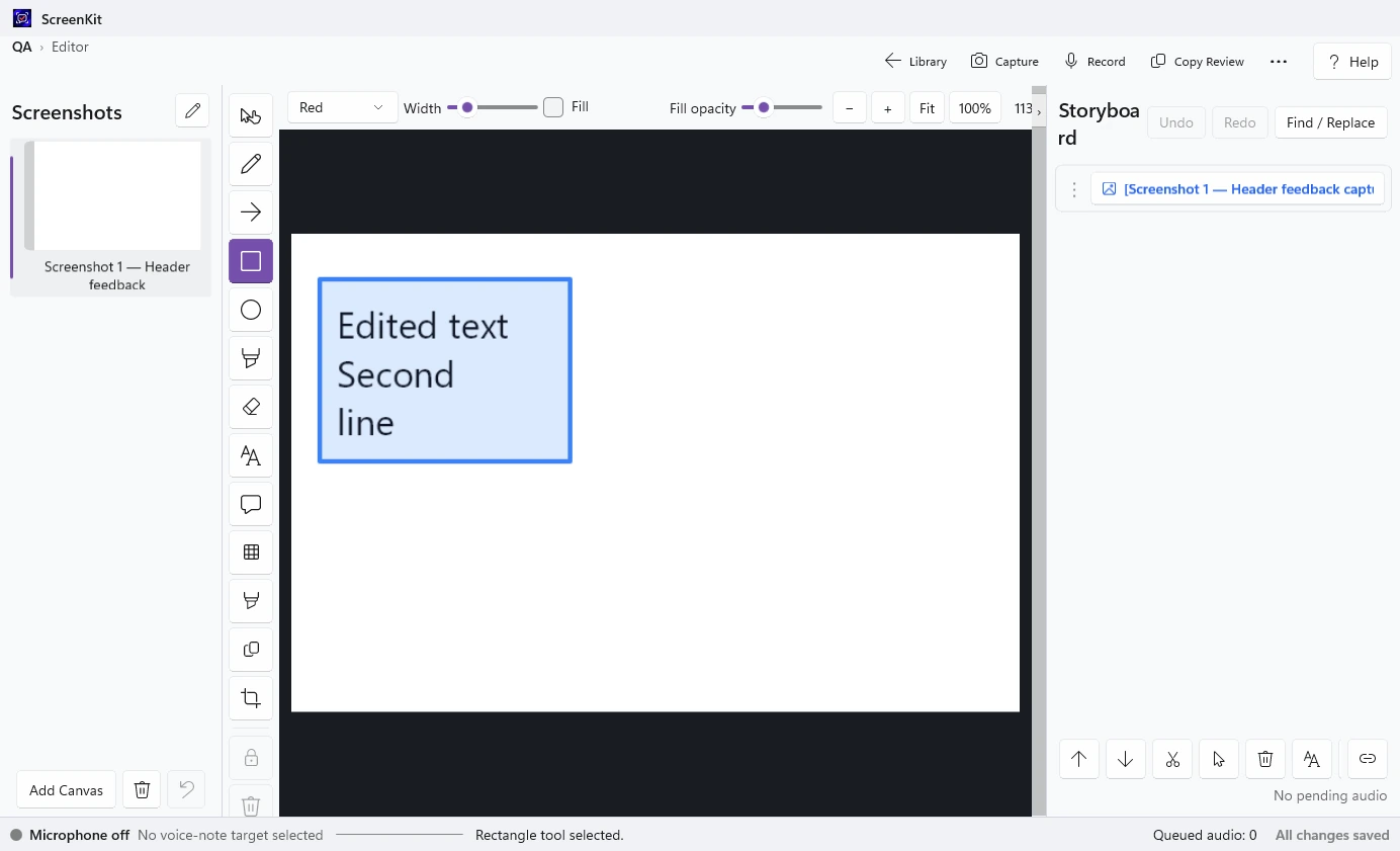
Real desktop interface · sample review
Where it started
A screenshot tells you what someone is looking at. A message tells you what they think. The trouble starts when those two things drift apart.
During creative reviews, the work moves between images, conversations and documents. A small change can need a surprising amount of explanation.
We built ScreenKit to keep the visual reference and the thinking together, from the first note to the final handoff.
Designed around the review
One workspace for the screen, the detail and the reason behind the change.
Screenshots, full-page captures and imported images give a review a shared point of reference.
Arrows, highlights, text and numbered callouts show exactly which part needs attention.
Written notes and editable voice transcripts sit alongside the relevant screenshot in an ordered storyboard.
A review packet brings images and notes together, ready to copy or export as a PDF.
A small example
A detail on the page. A note about what should change. A handoff that keeps both together.
ScreenKitInteractive walkthroughThoughtful objects for slower mornings
and everyday adventures.
Inside the desktop app
Screenshot thumbnails on the left. The canvas in the centre. An ordered storyboard beside it, ready to become a readable handoff.
Voice notes can become editable text, so the explanation stays useful after the conversation ends.
Screenshot references and their notes follow the storyboard order in the exported review.
Review material stays on your computer. Sharing is a deliberate next step.
Built here. Used here.
The review PDFs behind changes to this site came from ScreenKit.
Feedback on layout, navigation, spacing and creative direction arrived with its visual reference attached. The website became a practical place to use the tool while refining the experience.
That is the work we wanted it to do: make the next change easier to understand.
See the websiteA practical idea, made useful
Bring us the sticking point. A clearer process and a thoughtful interface can make everyday work feel simpler.
Let’s make it clearer
with this thought.